Material Design Icons Viewer
A cross platform desktop utility to search, copy, and embed material design iconsThis is the landing page for the Material Design Icons Viewer, a small free open source desktop utility to aid software developers. It's intended use is to help designers of software find and use icons from the Material Design Icon community led open source font.
The utility is compact, is available for a variety of desktop operating systems, and is programming language agnostic. With it, the task of searching for icons and using icons can be as easy as simply copy and paste.
What Does it Do
This utility presents designers of software with a nimble and browsable grid of over 6,000 icons. The incremental search feature quickly jumps between icons of interest. Users can copy the icon as plain text and paste them into their source code. If they prefer they can copy the Unicode code point, or even export icons to image files at any size or scale of their choosing.How Does it Work
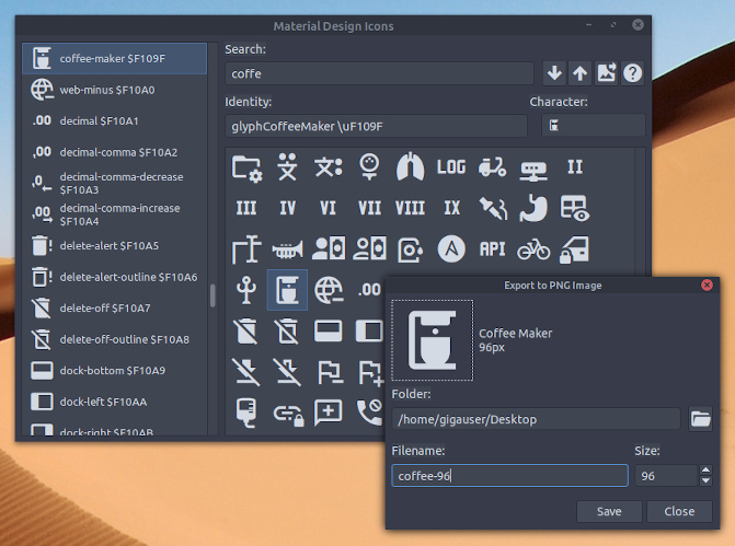
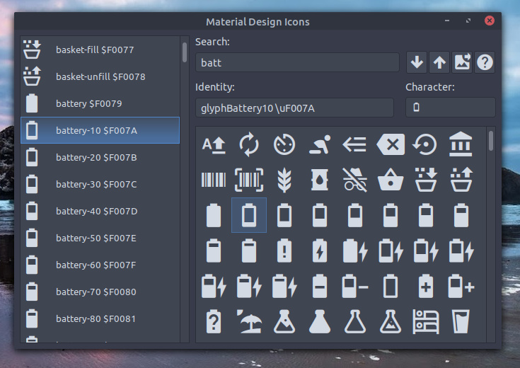
This utility presents users with a resizable grid of icons. A search box allows users to navigate between icons matching their input, while the arrow keys jump between matches. Information about the selected icon is displayed in fields that can be copied and pasted into your applications. Finally, it gives you the ability to export icons at any scale to PNG bitmaps.
When copying icons into your project you can often paste them as plain text directly into your source code. You can then scale the icons by altering your font size for the particular element you want to use as an icon. On most platforms (Windows XP being the exception) you can mix both regular latin text and icons together on the same line. When the icon as text is encountered the operating system will render the icon inline with your other text.
In situations where you are using text and icons together, you can also concatenate them together using any of your string functions. This allows you to easily dynamically alter the icons and text in your user interface based on some state within your program. This could be used for example to display a low battery icon right next to the text warning the user "Your battery is running low".
Although the examples and some source code provided on this page highlight the Free Pascal and the Lazarus, this utility can be used in cooperation with any text, code, or user interface editor.
This utility works on all versions of Microsoft Windows, and Linux. Downloads and source code are available at bottom of this page.
Help
When using this utility to view, extract, and add icons to your software projects you can choose from two different reuse options. You can either choose to distribute the material design icons font along with your project, or you can select certain characters for use and embed them in your project as bitmap glyphs. Each approach has several pros and cons.This section will help you understand why you might choose either option.
Option 1: Distributing the Font
Pros: Distributing the material design icon font with your project gives you the ability to easily dynamically scale your icons at runtime. It also is easier at design time to change or pick different icons for your user interface than the other approach of creating bitmap glyphs.Cons: You may need to write a setup installer to copy the font or add logic to extract and install the font for use by your program. Additionally, the end user might have a conflicting already installed version of the material design icon font on the computer they are already using.

Option 1: Using search to select an icon code point or character
When adding icons to your project using the first option you can simply copy the icon character from the utility and paste it into the caption or text property of the control. On some operating systems (Windows XP for example) you'll also need to set the font name property of the control to 'Material Design Icons'. On operating systems where the font name does not need to be set, you have the added bonus of being able to mix both normal latin characters and icon characters.
Another possibility of using the distributed font is that you have the additional option to set the icon using a code point. A code point is a unicode number used to designate a character glyph. This additional option would allow you, for example, to let the user pick or change the user interface icons.
To convert a code point into a string suitable for use in the caption of control you can use this programming code fragment.
The above snippet will work on all operating systems but not render correctly on Windows XP.
Cons: Extra steps are needed to pick and create bitmap glyphs at design time. You might need to consider recoloring your icons at runtime if you want to use system color themes. Some controls will not allow you to combine glyphs and text.

If you are using a non Debian based Linux distribution, here is a list of my build depends.
Copy, Paste, and Code Points
When adding icons to your project using the first option you can simply copy the icon character from the utility and paste it into the caption or text property of the control. On some operating systems (Windows XP for example) you'll also need to set the font name property of the control to 'Material Design Icons'. On operating systems where the font name does not need to be set, you have the added bonus of being able to mix both normal latin characters and icon characters.
Another possibility of using the distributed font is that you have the additional option to set the icon using a code point. A code point is a unicode number used to designate a character glyph. This additional option would allow you, for example, to let the user pick or change the user interface icons.
To convert a code point into a string suitable for use in the caption of control you can use this programming code fragment.
function UnicodeToStr(C: LongWord): string;
begin
  if C = 0 then
    Result := #0
  else if C < $80 then
    Result := Chr(C)
  else if C < $800 then
    Result := Chr((C shr $6) + $C0) + Chr((C and $3F) + $80)
  else if C < $10000 then
    Result := Chr((C shr $C) + $E0) + Chr(((C shr $6) and
      $3F) + $80) + Chr((C and $3F) + $80)
  else if C < $200000 then
    Result := Chr((C shr $12) + $F0) + Chr(((C shr $C) and
      $3F) + $80) + Chr(((C shr $6) and $3F) + $80) +
      Chr((C and $3F) + $80)
  else
    Result := '';
end;
The above fragment could be used like this with a TLabel control to display a low battery icon next to a bit of warning text.InfoLabel.Caption := UnicodeToStr($F007A) + ' Your battery is critically low';
The above snippet will work on all operating systems but not render correctly on Windows XP.
Option 2: Creating Bitmap Glyphs
Pros: There is no need to create an installer for your program. Alternate sized glyphs and caption text can be combined in some controls with different layout options. Works well with every operating system.Cons: Extra steps are needed to pick and create bitmap glyphs at design time. You might need to consider recoloring your icons at runtime if you want to use system color themes. Some controls will not allow you to combine glyphs and text.

Option 2: Using export to create a bitmap glyph
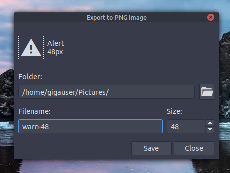
When adding icons to your project as bitmap glyphs you can use the utility program to export characters and png images. The export feature gives you the option to select an icon size and file location. You can then load the png images into any component with a graphic property. These include components such as TSpeedButton, TImage, TTrayIcon, and TImageList.
Note: TSpeedButton gives you the option to use both a glyph and a caption, allowing you to combine icons and text at different locations and of varying sizes in your button controls.
Be aware that you extra steps are needed if want to match system theme colors with your icons on the end user's computer. To change the color of a bitmap glyph to match a color you can use this programming code fragment.
It could also be used to make a yellow warning icon with a TImage like so.
Gylph Size and Color
When adding icons to your project as bitmap glyphs you can use the utility program to export characters and png images. The export feature gives you the option to select an icon size and file location. You can then load the png images into any component with a graphic property. These include components such as TSpeedButton, TImage, TTrayIcon, and TImageList.
Note: TSpeedButton gives you the option to use both a glyph and a caption, allowing you to combine icons and text at different locations and of varying sizes in your button controls.
Be aware that you extra steps are needed if want to match system theme colors with your icons on the end user's computer. To change the color of a bitmap glyph to match a color you can use this programming code fragment.
procedure Colorize(Bitmap: TBitmap; Color: TColor);
var
  W, H, X, Y: Integer;
  Source, Dest: PByte;
  A: Single;
begin
  if Bitmap.PixelFormat <> pf32bit then
    Exit;
  W := Bitmap.Width;
  H := Bitmap.Height;
  if (W < 1) or (H < 1) then
    Exit;
  Color := ColorToRGB(Color);
  Source := @Color;
  Bitmap.BeginUpdate;
  for Y := 0 to H - 1 do
  begin
    Dest := Bitmap.RawImage.GetLineStart(Y);
    for X := 0 to W - 1 do
    begin
      A := Dest[3] / 255;
      Dest^ := Trunc(Source[2] * A);
      Inc(Dest);
      Dest^ := Trunc(Source[1] * A);
      Inc(Dest);
      Dest^ := Trunc(Source[0] * A);
      Inc(Dest);
      Inc(Dest);
    end;
  end;
  Bitmap.EndUpdate;
end;
The above fragment could be used to change the glyph of a TSpeedButton to match the system defined windows text color.Colorize(ExportButton.Glyph, clWindowText);
It could also be used to make a yellow warning icon with a TImage like so.
Colorize(WarningImage.Picture.Bitmap, clYellow);
Download and Source Code
Downloads of Material Design Icons Viewer are available for Microsoft Windows, and Debian Linux distributions. The source code is available on github here.
If you are using a non Debian based Linux distribution, here is a list of my build depends.
libgtk2.0-dev libcairo2-dev libpango1.0-dev libgdk-pixbuf2.0-dev libatk1.0-dev libghc-x11-dev
Comments and Suggestions
If you want to comment or make a suggestion to improve this utility, consider leaving a comment here.